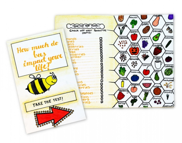
Supplies:
- Crayola Crayons - 24 Count
- Crayola Marker & Watercolour Paper - 22.9 cm x 30.5 cm (9" x 12")
- Crayola Sketchbooks - 1 per student
- Crayola Fine Line Markers - 12 Count
- Crayola Broad Line Markers - 16 Count
- Rulers
- Pencils
- Erasers
- Cardstock Paper - 21.6 cm x 27.9 cm (8 ½" x 11") - 1 per student
Steps:
1
- Choose the orientation you want to use for your brochure.
- horizontal
- vertical
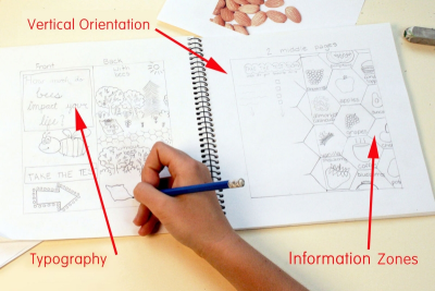
- square - Draw some layout ideas in your sketchbook.
- Use boxes and lines to indicate:
- information zones
- framing - negative space or borders
- typography - font weight, size, slant - Choose the design you like the best.
2
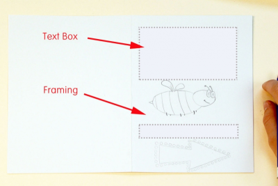
- Use a pencil to lightly draw the compositional framework on your good paper.
- text boxes
- framing
- image boxes - Use a pencil to draw the pictures.
- Lightly pencil in the text.
- Share your work with a partner to get feedback about the composition and check the spelling.
- Make any changes.
3
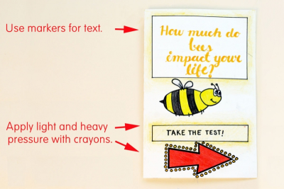
- Use markers to colour in the text.
- Use crayons to colour the images.
- Apply light and heavy pressure with the crayons to make the pictures stand out.
4
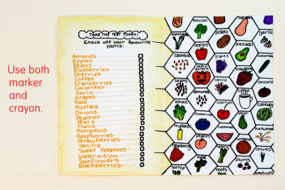
- Use both marker and crayon to create contrast.
Subjects:
Grades:
Grade 4,
Grade 5,
Grade 6,
Grade 7,
Grade 8,
Grade 9