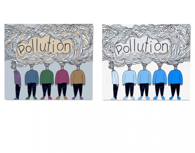
COMPARE AND CONTRAST COLOUR SCHEMES – Colour RelationshipsStudents digitize a line drawing they created in another class, and use a photo editing program such as Photoshop to create several new versions with different colour schemes. Then they write a compare-and-contrast analysis of 2 of the new versions in order to evaluate their effectiveness in communicating a message.
Students digitize a line drawing they created in another class, and use a photo editing program such as Photoshop to create several new versions with different colour schemes. Then they write a compare-and-contrast analysis of 2 of the new versions in order to evaluate their effectiveness in communicating a message.
Supplies:
- Crayola Sketchbooks - 1 per student
- Crayola Coloured Pencils - 24 Count
- Crayola Markers - 24 Count
Steps:
1
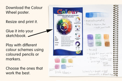
- Download the Colour Wheel poster. (Downloads - ColourWheel.pdf)
- Resize and print it.
- Glue it into your sketchbook.
- Play with different colour schemes using coloured pencils or markers.
- Think about the meaning the colours you choose might communicate when used in your design. (Downloads - CulturalColour.pdf) - Choose the ones that work the best.
2
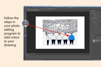
- Follow the steps in your photo editing program to add colour to your drawing.
- See the Photoshop Basics lesson plan available on this website.
3
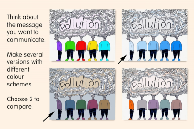
- Think about the message you want to communicate.
- Make several versions with different colour schemes.
- Choose 2 to compare.
4
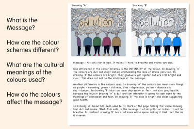
- Write a compare-and-contrast analysis of the 2 drawings to evaluate how effective the colour schemes are in communicating your message.
- Decide if you are going to contrast the drawings, compare the drawings or do both.
- State the message you intended to communicate.
- Contrast the 2 colour schemes using phrases such as – one difference; another difference; in contrast.
- Compare the 2 colour schemes using phrases such as – one way they are similar; another way they are similar; in a similar way.
- Write a summary statement to show which of the 2 colour schemes you feel is most effective in conveying your message. - Downloads - Colour Schemes Self-Assessment.pdf, Colour Schemes Tracking.pdf
Subjects:
Grades:
Grade 7,
Grade 8,
Grade 9
